Switch To Dev Portfolio

Patients First, simplifying access to care

A research driven redesign of online appointment booking that reduces confusion, builds trust, and improves access for patients across different levels of digital literacy.

Doctor speaking with a patient beside a calendar with a checkmark

Patients First is a healthcare design project focused on making online appointment booking simple, accessible, and trustworthy.

This multi phase study covers research, prototyping, and usability testing, with the goal of reducing barriers and helping patients book care with confidence.

Patients First UX Case Study Preview

  • Project Type: Academic, capstone

  • Duration: March to May 2025

  • Role: UX Researcher, UX/UI Designer

  • Platform: Web and mobile

  • Focus: Accessibility, usability, trust

  • Tools: Figma, Miro, Google Docs

Discovery

What is the problem

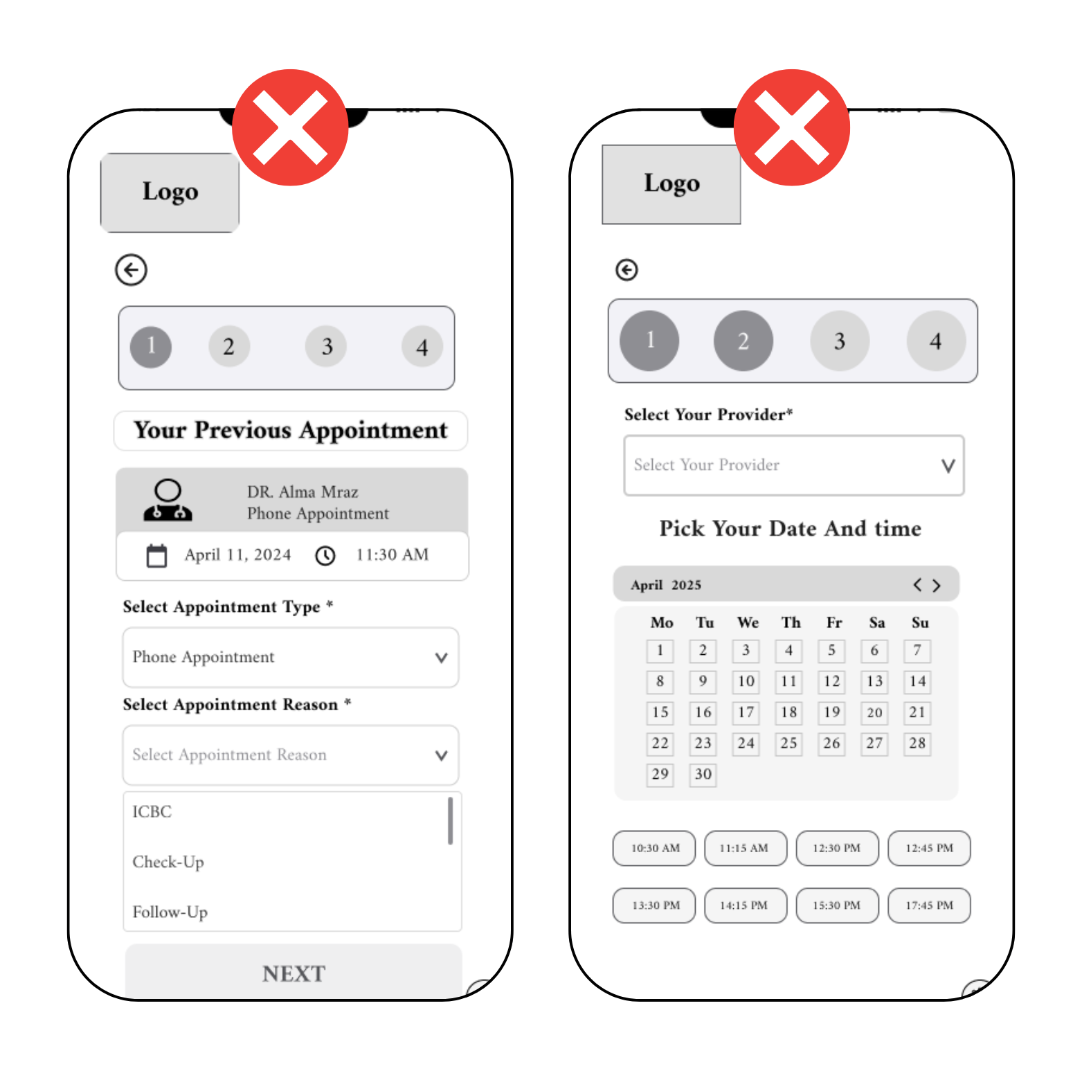
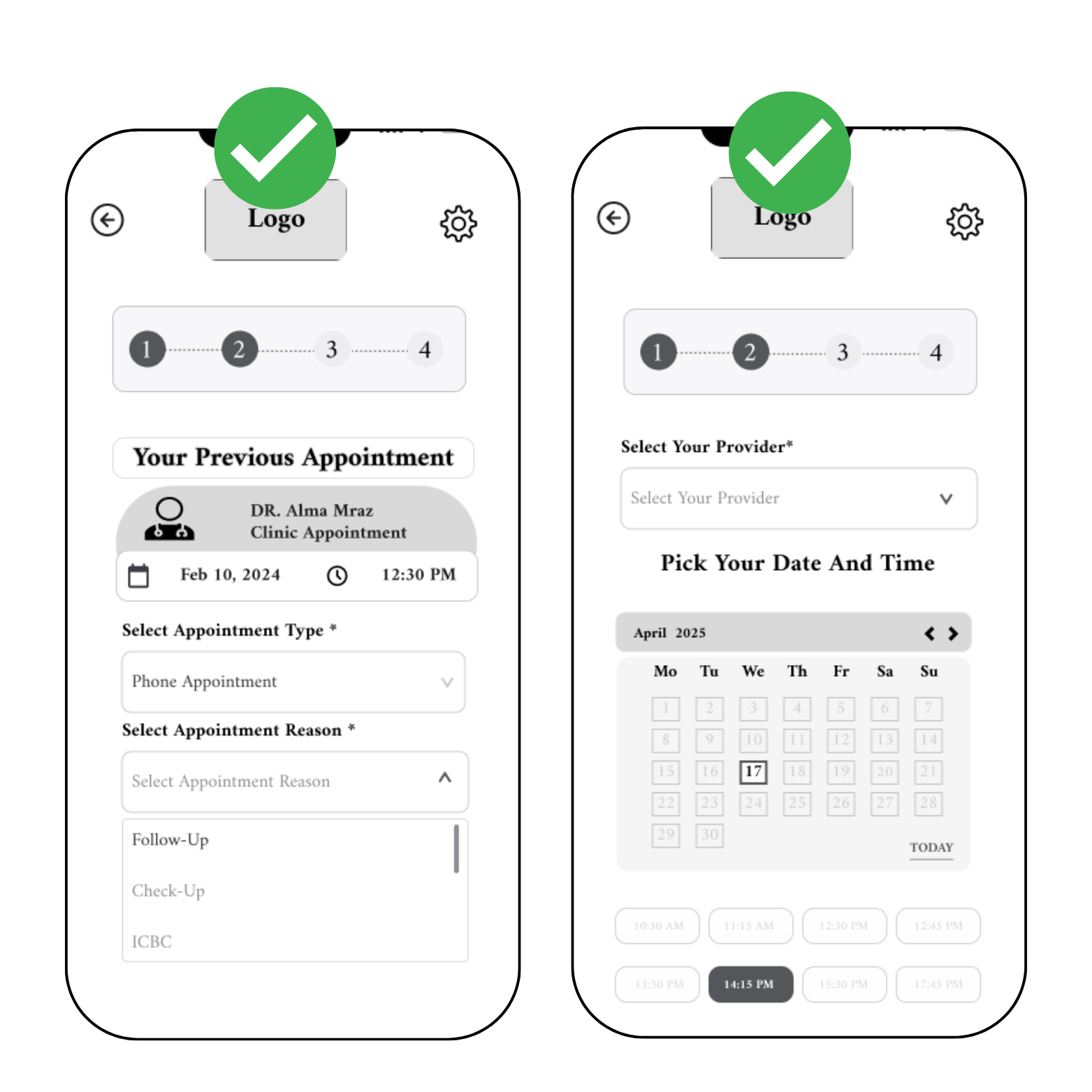
Why online appointment bookings fail

Online healthcare booking remains inaccessible for many patients. A lack of user friendly digital tools pushes people back to phone calls and in person visits. Combined with lower digital confidence and concerns about privacy, this creates delays and missed care.

For patients, the process often feels uncertain: “Why is this so complicated” and “Can I trust this system with my health information”. This frustration leads to abandoned flows and busy phone lines.

In interviews, 4 of 4 participants reported confusing layouts or unclear navigation. 3 of 4 raised privacy concerns. Missing or weak confirmations increased doubt and led to drop offs.

How might we

How might we help patients feel confident booking an appointment online, so they can access care quickly without frustration and clinics can reduce delays and phone volume

Outcome target: clear, trustworthy booking flows with visible confirmations, privacy reassurance, and accessibility features that give patients certainty at every step.

Assumptions and hypotheses

Before research, I captured assumptions about online booking. These informed the hypotheses that guided design and testing.

Assumptions

  • 1- Patients have their Health ID and Date of Birth available at booking time.
  • 2- Clear confirmations on screen and by email or SMS reassure patients that a booking succeeded.
  • 3-Most patients book on mobile during breaks, so the flow must be quick and accessible.
  • 4- Privacy and trust cues are essential for adoption.
  • 5- Clinics can send confirmations through existing systems.

Hypotheses

  • H1: Clear selected and disabled states in the calendar reduce errors and speed up booking.
  • H2: Visible privacy cues during login and data entry increase trust and reduce abandonment.
  • H3: Immediate confirmations and reminders reduce verification calls to clinics.
  • H4: A larger, consistent back button reduces navigation errors and improves satisfaction.
  • H5: Plain language improves success for patients with lower digital literacy.

Quantitative Research

To validate our qualitative findings, I measured how patients interact with existing online booking tools. The results highlight why so many people abandon digital systems and return to phones or walk-ins.

All participants struggled with usability, confusing layouts, unclear navigation, or missing confirmations. Three out of four raised concerns about privacy, showing trust is still fragile. Most said they would revert to calling the clinic when the online process felt incomplete or unreliable.

82% faced confusing layouts

Patients could not easily identify the next step. Buttons blended into the background, navigation labels were unclear, and many described the experience as “trial and error.”

82%
75%

75% worried about privacy and data security

Concerns included stolen health information, unclear data policies, and the lack of visible security cues. Patients felt more comfortable on the phone, even if it meant waiting on hold.

60% abandoned when confirmation was unclear

Without an immediate success message or reminder, patients assumed the booking failed. Many ended up calling the clinic to double-check, defeating the purpose of an online system.

60%

Design

“I just want booking to be simple and safe. If I can trust it and finish fast, I will use online instead of calling.”

User persona: Mira Johnson

Bio

Mira books both family doctor and specialist visits for a recurring back issue. She values efficiency and trust. Phone lines are busy during her work hours, and online booking often feels unclear. She needs a simple, reliable way to manage appointments without wasting time.

Frustrations

  • Confusing booking flows and unclear navigation
  • Lack of confirmations after booking
  • Concerns about privacy and data security
  • Busy phone lines and long waits

Motivation

  • Book appointments quickly during breaks
  • Get clear confirmations and reminders
  • Avoid waiting on hold and missed care due to delays

Empathy map

  • “Why is booking online so complicated”
  • “Can I trust this system with my health info”
  • “Did my appointment actually go through”
  • “I will just call the clinic, it feels safer”
  • Calls the clinic when online booking feels unclear
  • Tries multiple times to select dates on the calendar
  • Looks for confirmation emails or texts after booking
  • Gives up if the process feels untrustworthy
  • Frustrated by unclear navigation
  • Anxious about entering personal health information
  • Relieved when booking confirmation arrives
  • Overwhelmed by long hold times
  • Worried about privacy and data security
  • Concerned about wasting time on a system that may not work
  • Wants reassurance through clear confirmations and reminders
  • Believes booking should be simple, fast, and trustworthy

Effortless path to care

The flow mirrors real booking behavior and reduces friction at each step. Authentication sets trust, appointment details are plain language, the calendar is scannable, and confirmation is visible with an Add to calendar action.

Solution overview

I designed Patients First, a booking solution that reduces hesitation and confusion with a simple step by step flow, stronger privacy signals, and visible confirmations. Patients can complete booking with confidence on any device.

  • Guided task flow: a clear progression from visit type to confirmation that reduces navigation errors.
  • Accessible calendar: larger tap targets and clear states for selection and disabled times.
  • Privacy assurance: inline messaging and security indicators that build trust during data entry.
  • Confirmation and reminders: immediate confirmation with follow up notifications.

Outcome: a trustworthy, user centered booking system that helps patients complete appointments online and reduces clinic call volume.

  • HIN and DOB
  • Visit type concept
  • Calendar solution
  • Home page
  • Review step

Wireframes and prototype preview V1

High level wireframe preview
VIEW FIGMA

Validation

Patients First user testing

Two remote rounds focused on clarity, guidance, and confidence at booking. Each round shows the key issues and the shipped improvements.

Search clarity, homepage guidance, required labels

Before Round One, screens before changes
After Round One, screens after changes

Key findings

  • Settings icons and labels sat in unexpected locations, which reduced clarity.
  • The back button was small, and steps were not obvious.
  • Active but non functional options for appointment type and reason caused confusion.
  • Calendar selection was unclear, which led to mistakes.

What changed

  • Repositioned the settings icon near the logo and added descriptive text for visibility.
  • Increased the back button size and clarified the step sequence.
  • Disabled non functional options to guide users.
  • Redesigned the calendar with clearer labels and a guided layout.

Final Wireframe and Prototype

Final deliverables

Final wireframe and prototype

This flow validates onboarding, health number entry, and date of birth capture. Explore the interactions and error states that tested best.

Patients First onboarding screen on an iPhone with inputs for health number and date of birth.
Onboarding, health number input, and date of birth
  • Settings icon moved near the logo
  • Larger back button and clearer steps
  • Disabled unavailable options
  • Calendar layout clarified

learnings

Key Learnings

These are the takeaways I will bring to future healthcare projects.

  • Guidance must appear at the point of action

    Inline help near the size picker was more effective than sending people to a separate chart.

  • Trust is shaped by microcopy

    clear wording about privacy reduced hesitation.

  • Accessibility is a requirement

    larger tap targets, contrast, and step by step flows improved success.

  • Confirmation builds confidence

    visible confirmations and reminders reduced drop offs

  • Small issues add up

    unclear navigation and missing back actions created outsized frustration.

Outcome: clear guidance at the moment of choice, measurable impact, and inclusivity by default.

Next step

Next steps

Focused follow ups will validate outcomes at scale, improve accessibility, and build trust during booking.

  • Run a pilot with one clinic

    Track completion, time to book, and drop offs by step.

  • Validate the calendar fix

    Second usability test with five participants, target four of five successful completions.

  • Privacy and trust pass

    Add in flow security copy, visible confirmation receipts, and clear data policy links.

  • Accessibility audit

    Check contrast, focus order, keyboard paths, and screen reader support.

  • Localization and reminders

    Plain language and SMS or email confirmations in English and Farsi.

  • Analytics and performance

    Instrument errors and confirmations, optimize for mobile load time.

Goal: ship a clear, trustworthy booking flow that patients finish quickly, and clinics see fewer calls and missed appointments.