Financial tasks are spread across multiple tools
Payroll, budgeting, expenses, and cash flow decisions are often handled across disconnected platforms. This fragmentation makes financial management more time-consuming and difficult to follow.
Private Portfolio Access
Access to this project is restricted due to product and workflow confidentiality. Please enter the password to continue.
Case Study
Designing a marketing website that helps small business owners understand financial tools faster, build trust in the platform, and immediately recognize the product’s value.
Overview
Grow is a SaaS platform that helps small businesses manage payroll, budgeting, and AI-guided financial workflows in one place. The marketing website was designed to communicate a complex product in a clear, approachable way while building trust with business owners.
My role focused on defining the website structure, strengthening visual hierarchy, and creating responsive layouts that made the platform’s core capabilities easier to understand across devices.
Problem Framing
Small business owners often manage critical financial responsibilities without dedicated support. Existing tools are frequently fragmented, overly technical, and difficult to interpret, which makes decision-making slower and more stressful.
Payroll, budgeting, expenses, and cash flow decisions are often handled across disconnected platforms. This fragmentation makes financial management more time-consuming and difficult to follow.
Many interfaces are designed around accounting logic rather than everyday business decisions. Technical language and complicated workflows make it hard for users to know where to begin.
Without clear guidance and accessible explanations, business owners struggle to interpret information confidently. As a result, actions related to planning, hiring, or spending are often postponed.
“Managing finances shouldn’t feel like running an accounting firm inside a small business.”
Design Framing
Before exploring solutions, I outlined key assumptions about why small business owners struggle with financial tools. These assumptions informed the hypotheses that shaped the direction of the design.
If financial tools are presented in a simplified and structured way, small business owners will feel more confident navigating their financial tasks.
If key financial insights are explained in plain language, users will better understand what actions they need to take.
If guidance and decision support are integrated into the experience, users will rely less on external tools or advisors and more on the platform itself.
If trust signals such as testimonials, proof points, and clearer explanations are made more visible, small business owners will feel more comfortable exploring the platform and its capabilities.
How Might We
How might we help small business owners understand and manage their financial operations with confidence so they can make better decisions, reduce complexity, and spend less time navigating financial tools?
Final result: a clearer, more approachable financial platform that supports everyday business decisions.
Research Highlights
Key patterns observed in how small business owners experience fragmented financial tools and unclear product workflows.
Many small business owners rely on several disconnected tools for payroll, expenses, and budgeting. Switching between platforms increases complexity and slows down everyday financial tasks.
Financial interfaces often use accounting terminology and complex data structures. Non-experts struggle to understand what actions they should take based on the information presented.
When financial insights are difficult to interpret, business owners postpone decisions related to budgeting, hiring, or spending. This hesitation can affect planning and operational confidence.
Persona
Maria is a 38-year-old small business owner managing a growing team while handling day-to-day operations herself. She is comfortable using digital tools, but financial management still feels overwhelming because information is spread across multiple systems and often presented in technical language. She wants a clearer, more approachable way to understand her finances and make decisions with confidence.
Empathy Map
Clarity, confidence, and control
Solution
I designed the Grow marketing website to make a complex financial platform easier for small business owners to understand. The experience focuses on clarity, trust, and structured messaging that helps visitors quickly grasp what the product does, how the platform is organized, and why it matters to their business.
Outcome A marketing website that helps small business owners quickly understand the product, evaluate its relevance, and feel confident exploring the platform.
A structured introduction that explains the platform and its value in simple, direct language.
Financial tools organized into clear sections so visitors can quickly understand core capabilities.
Complex financial concepts translated into approachable explanations for non-experts.
Visual hierarchy, supportive content, and clean structure designed to build credibility.
Design System
The typography system balances expressive headlines with highly readable body text. Marope is used for headings to create a distinctive and confident brand presence, while Fira Sans ensures clarity and accessibility across paragraphs, interface text, and supporting content. Together, they create a tone that feels modern, approachable, and trustworthy.

Regular, Medium, SemiBold, Bold

Regular, Medium, SemiBold, Bold
Visual Language
Marketing Website
The Grow marketing website was designed to communicate a complex financial platform in a clear and approachable way for small business owners. The structure focuses on simple messaging, clear product explanations, and visual hierarchy that guides visitors through the platform’s core value and capabilities.
View Figma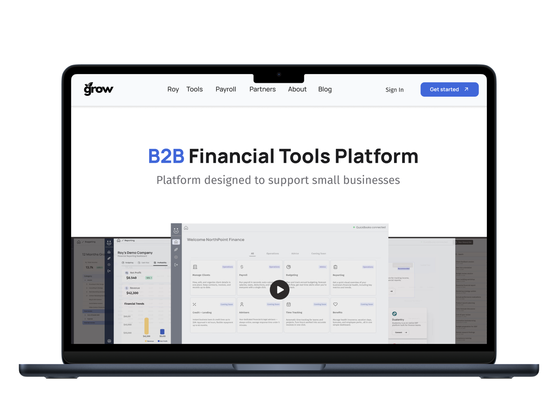
Reflection
Key takeaways from designing a marketing experience for a complex financial product.
Small business owners are often overwhelmed by financial tools. Clear explanations and simple messaging help visitors understand value faster.
Organizing product capabilities into clear sections helps visitors understand how the platform supports their business.
Financial terminology can feel intimidating. Using clear, approachable language helps non-experts feel more confident exploring the platform.
Visual hierarchy, clear explanations, and consistent design help visitors feel confident evaluating a new financial platform.
The first interaction with a product often happens through its website. Clear structure and messaging strongly influence whether visitors continue exploring.
Outcome: a marketing experience that helps visitors quickly understand the product, builds trust, and encourages further exploration.
Future Improvements
Opportunities to refine the marketing experience, improve clarity, and strengthen trust for new visitors exploring the platform.
Conduct usability testing with small business owners to ensure the product value and key capabilities are quickly understood.
Improve the narrative structure from hero section to feature explanations so visitors can understand the platform faster.
Track metrics such as scroll depth, CTA clicks, and feature section engagement to evaluate how effectively the website communicates the product.
Introduce testimonials, product examples, and clearer proof points to help visitors feel confident exploring the platform.
Verify contrast ratios, keyboard navigation, and readability to ensure the website remains accessible to a wide range of users.
Goal: create a marketing website that clearly communicates the product, builds trust, and encourages small business owners to explore the platform further.

