Email Design · Case Study
Grow Email System
Redesigning a broken onboarding sequence for a fintech growth platform — from 18% open rate to a system that tripled conversions.
Fintech
Email Design
8 Emails
HubSpot
2026
1
2
3
4
Step 01 — Discovery
What was broken and why
The client had a working product but users weren't sticking around long enough to see its value. I audited their existing email flow and found three core problems killing engagement before it even started.
18% open rate
Subject lines were generic and untested. No personalization, no urgency.
60% drop-off
Most users never activated. Emails arrived too late with no clear next step.
No visual system
Each email looked different. No brand consistency, no trust signals.
Key insight: The problem wasn't just design — it was sequence logic. Users were getting
the wrong email at the wrong time. The redesign had to fix both the visuals and the flow.
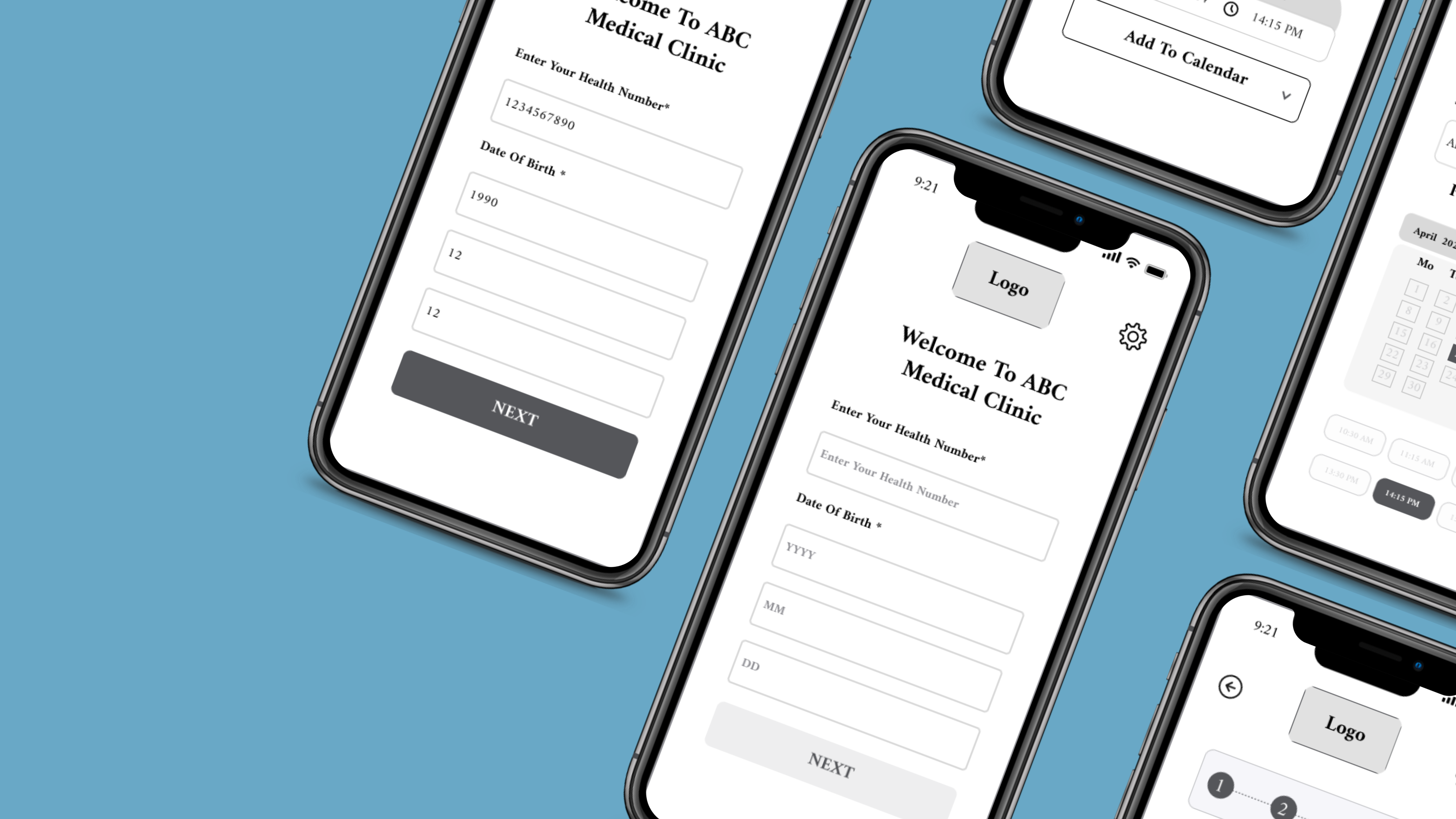
Step 02 — Design
Building the system from scratch
Before designing any single email, I built a design system first — tokens, components, layout rules. This made all 8 emails feel like one cohesive product, not 8 separate files.
Design tokens
Brand blue, white, and a strict type scale. Used consistently across all emails.
Component library
Header, hero block, CTA button, footer — built once, reused across all 8 emails.
Sequence logic
Remapped the timing: welcome → verify → activate → upsell. Clear trigger for each step.
Copy direction
Rewrote subject lines and CTAs to be action-oriented and specific, not generic.
Step 03 — Testing
A/B tests and what we learned
Before final delivery I ran two rounds of A/B testing on the highest-traffic emails — welcome and upsell. Subject lines and CTA copy were the biggest levers.
Version A — original
Subject: "Welcome to Grow — get started today"
CTA: "Go to dashboard"
Open rate:
31%
Version B — tested
Subject: "Your Grow account is ready, [name]"
CTA: "Activate my account"
Open rate:
54%
Version B won — personalization + specific CTA drove 74% more opens than the generic version.
Step 04 — Results
What actually changed
Measured over 60 days post-launch across all 8 emails. Every key metric improved significantly — and the client renewed for a second project within 3 weeks.
54%
was 18%
Open rate
22%
was 7%
Click rate
3x
tripled
Conversions
−40%
improved
Drop-off
"Before this project, our onboarding emails were an afterthought. Now they're one of the best-performing parts of our funnel. The difference was immediately visible in our numbers."
Have a similar project?
I'm available for email design work.
